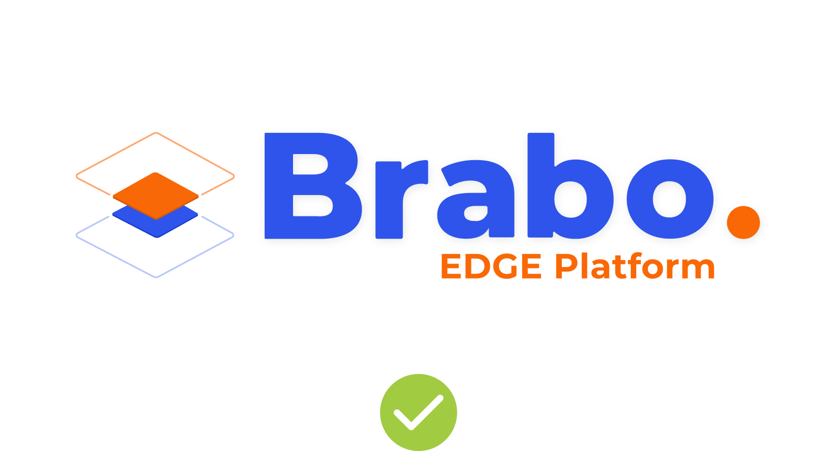
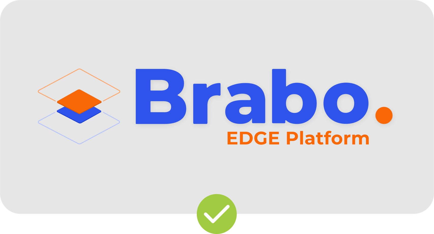
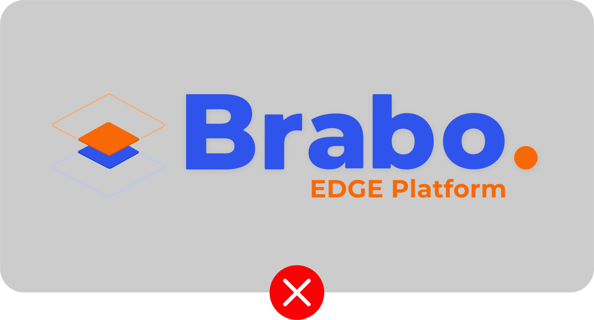
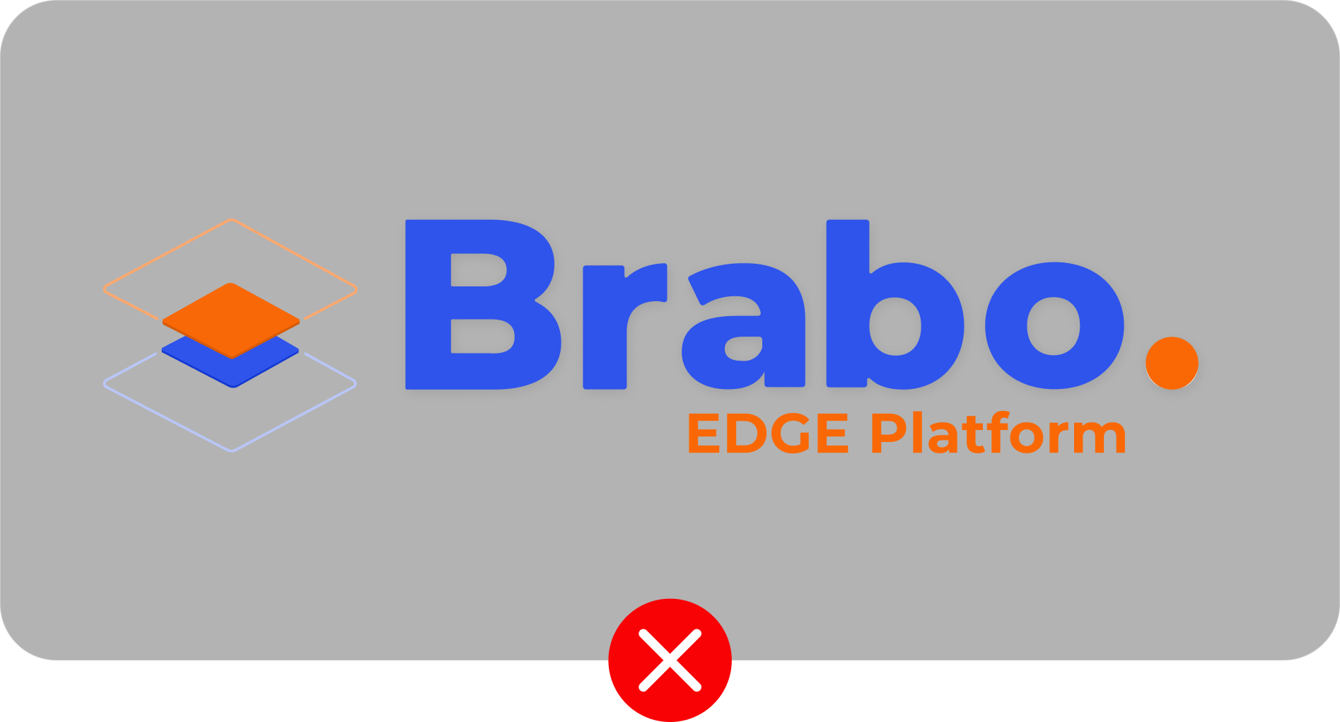
When it comes to placing a logo on a background, it's important to strive for a contrast ratio of at least 2.4:1. This helps to ensure that the logo remains legible and visually distinct. If the contrast falls short of this standard, it may be necessary to tweak the background or consider alternative options in order to achieve the desired level of contrast. Remember, a little contrast can go a long way in making our logo stand out!

BRAND IDENTITY
SCROLL
Readability
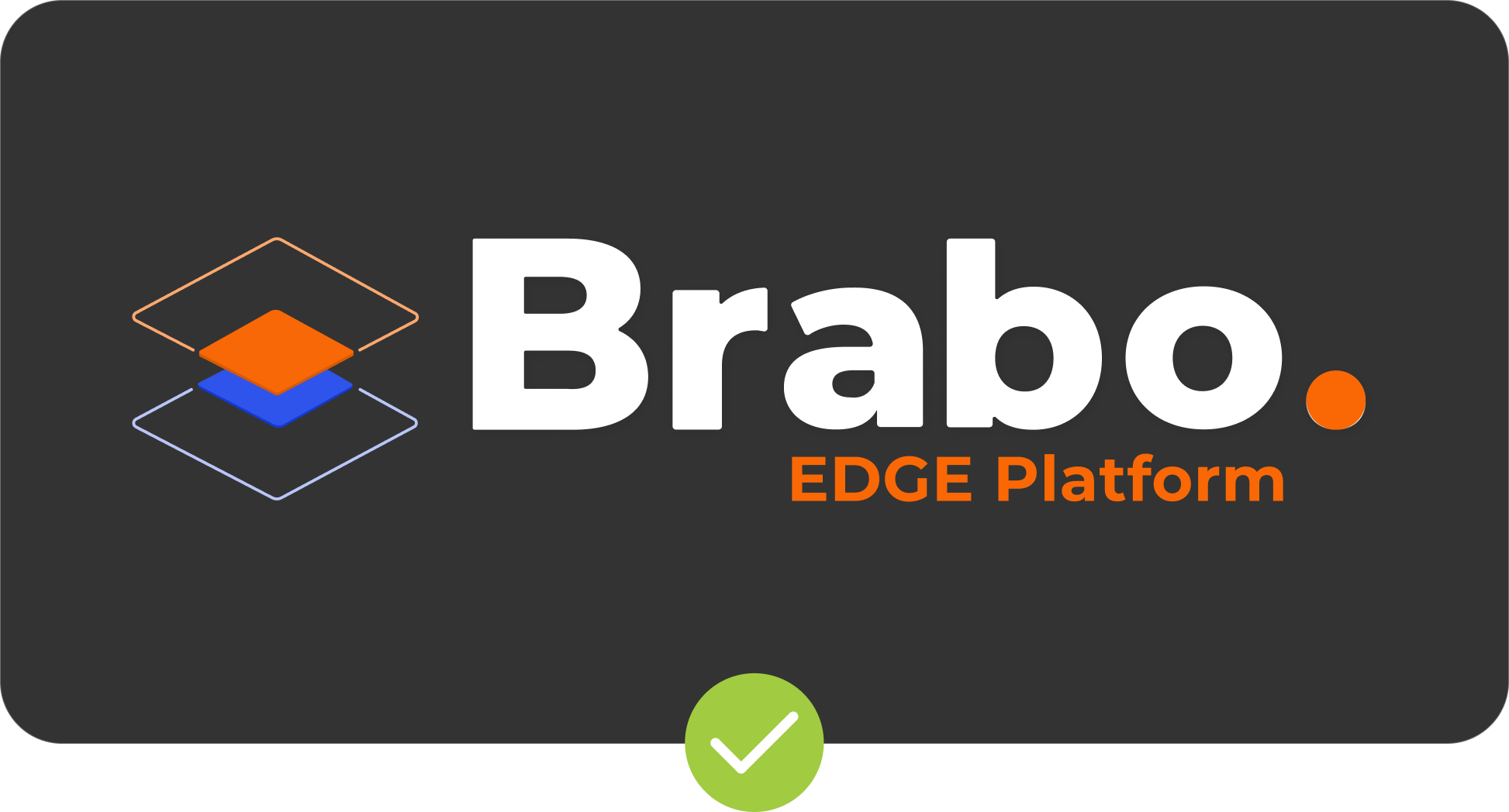
0% Black
2.99:1
10% Black
2.4:1
20% Black
1.86:1
30% Black
1.42:1
40% Black
1.05:1
50% Black
1.31:1
60% Black
1.91:1
70% Black
2.82:1
80% Black
4.21:1
90% Black
5.8:1
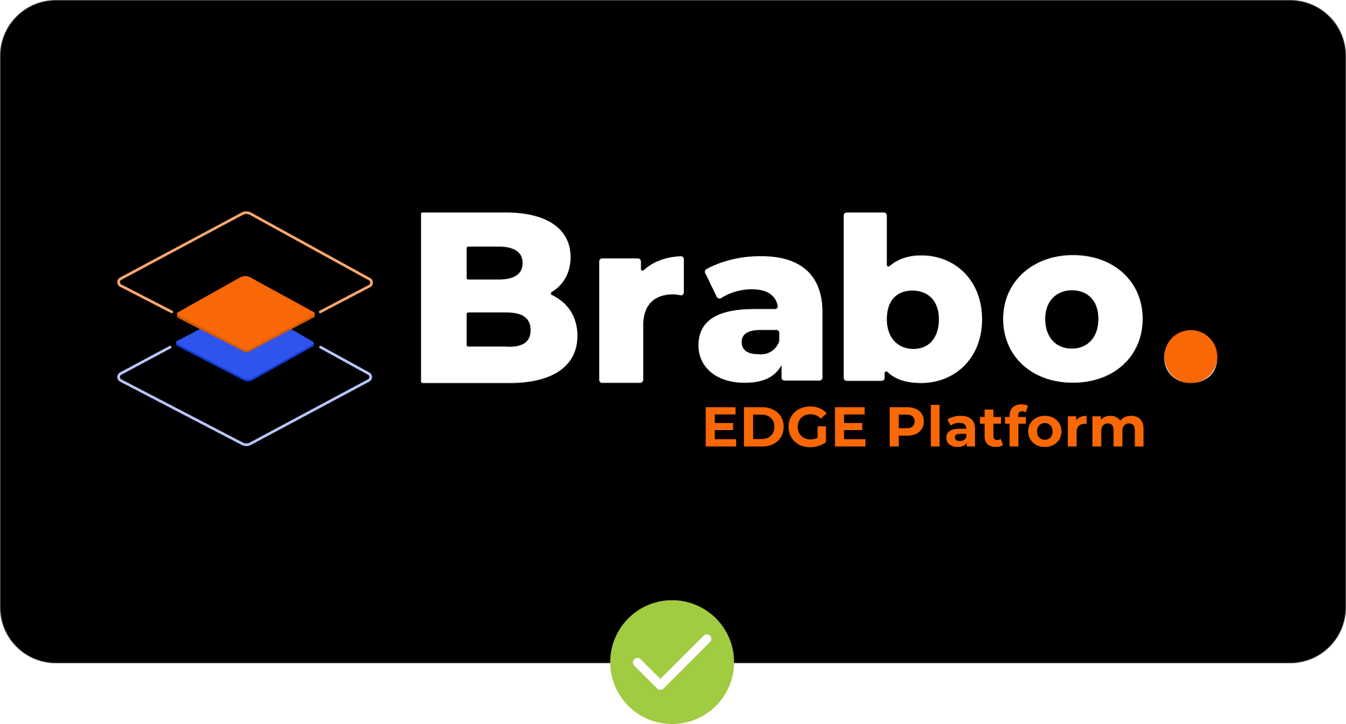
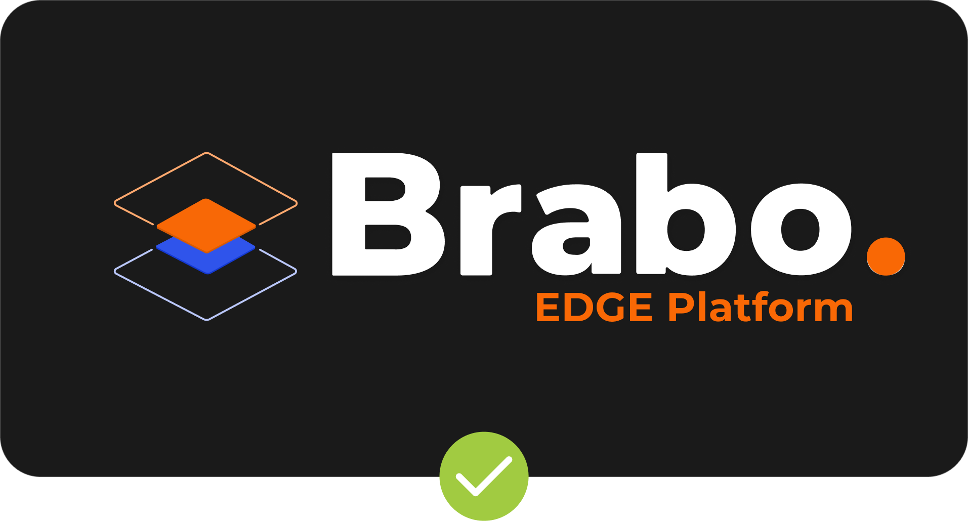
100% Black
7.01:1
Special Cases
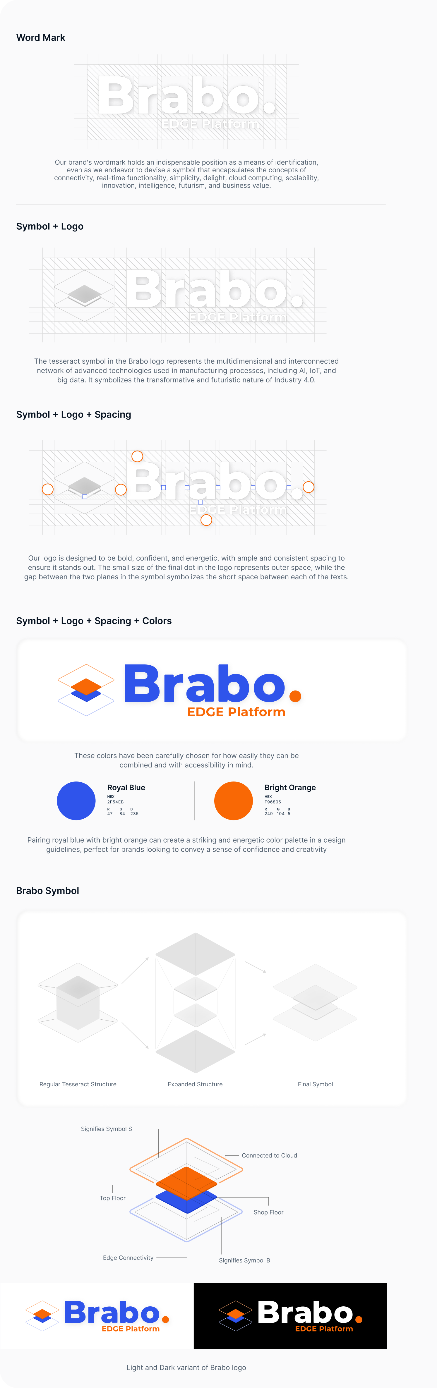
Our symbol and word mark are versatile and can be used separately as needed. They are adaptable to either complete white or complete black backgrounds depending on the design requirements.
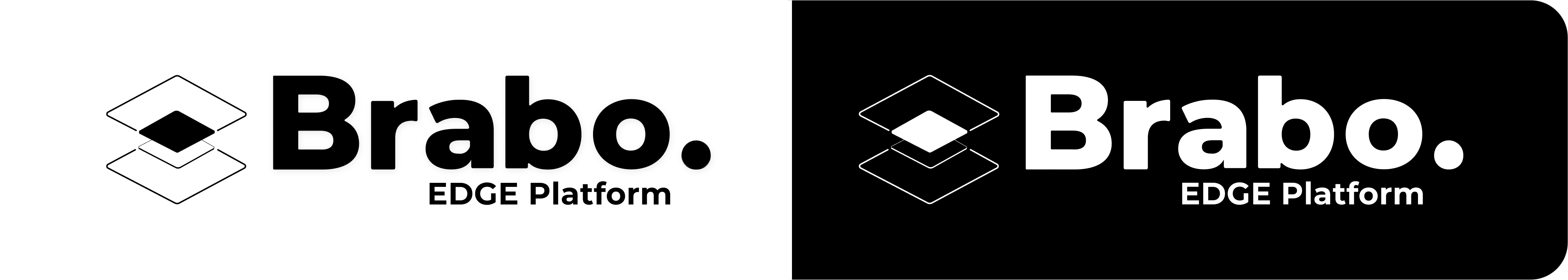
These logo variations are suitable for limited color usage, such as print, or when the background color falls below the required contrast ratio
Things To Remember
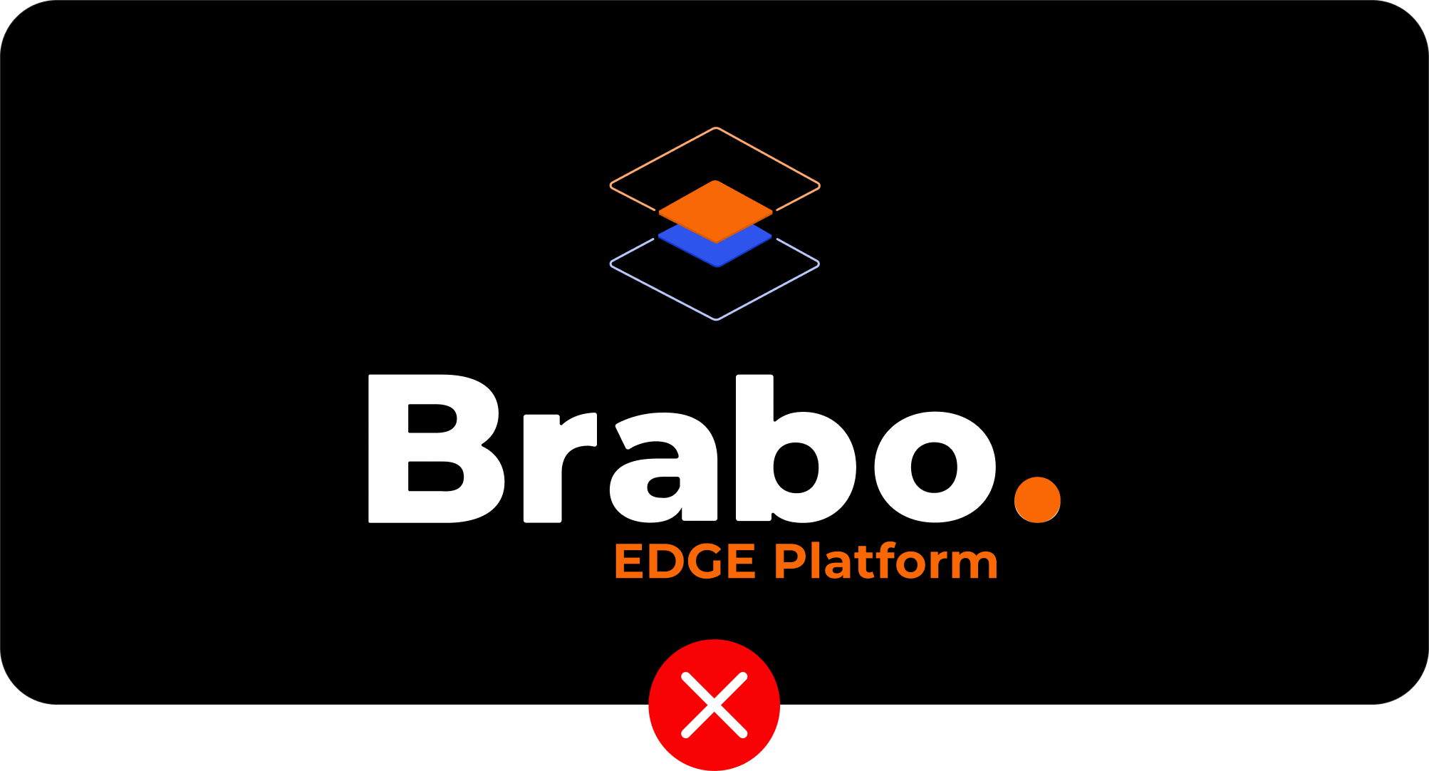
Using our logos consistently is key to building a strong brand identity. Please always keep in mind the proper use of the Brabo logo.
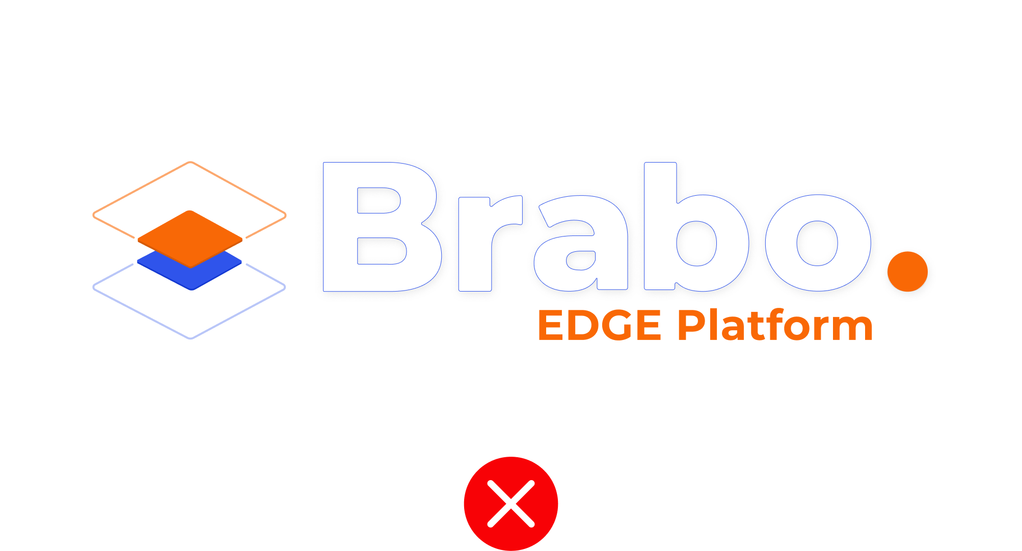
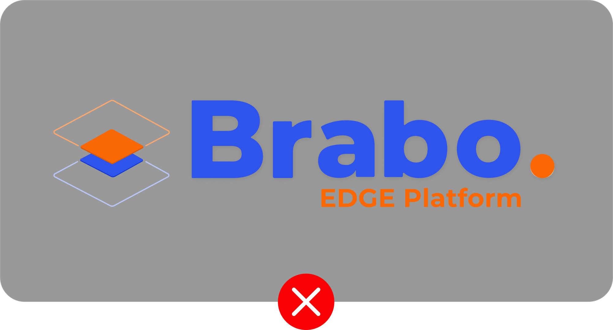
Don't use only outline for Word mark
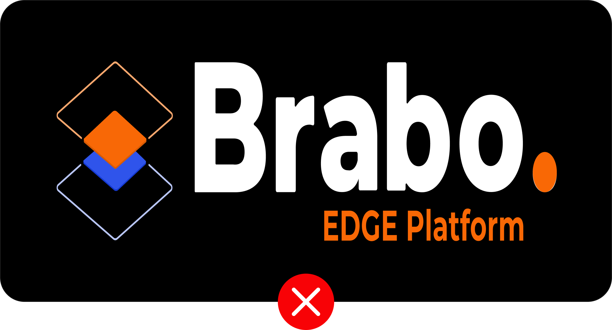
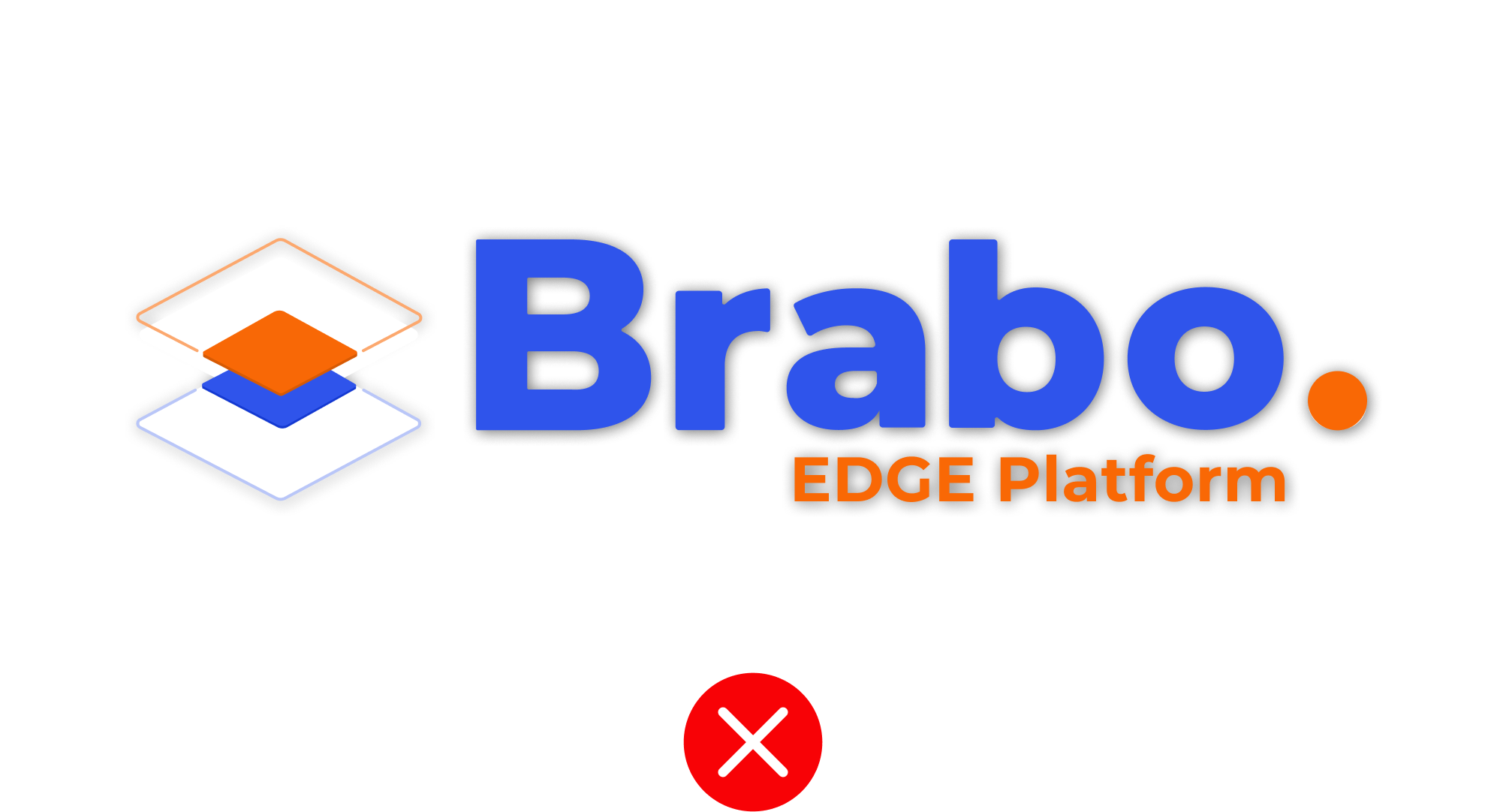
Edge Platform should not be missed
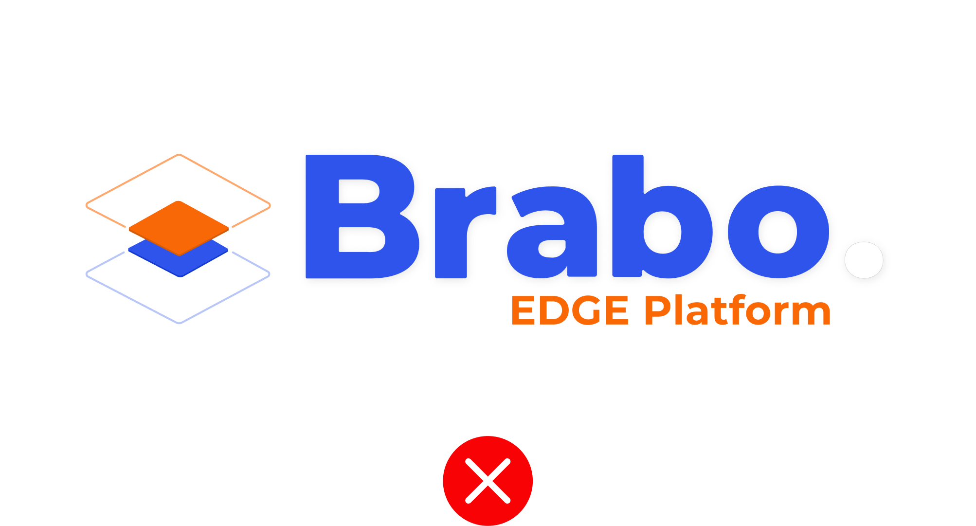
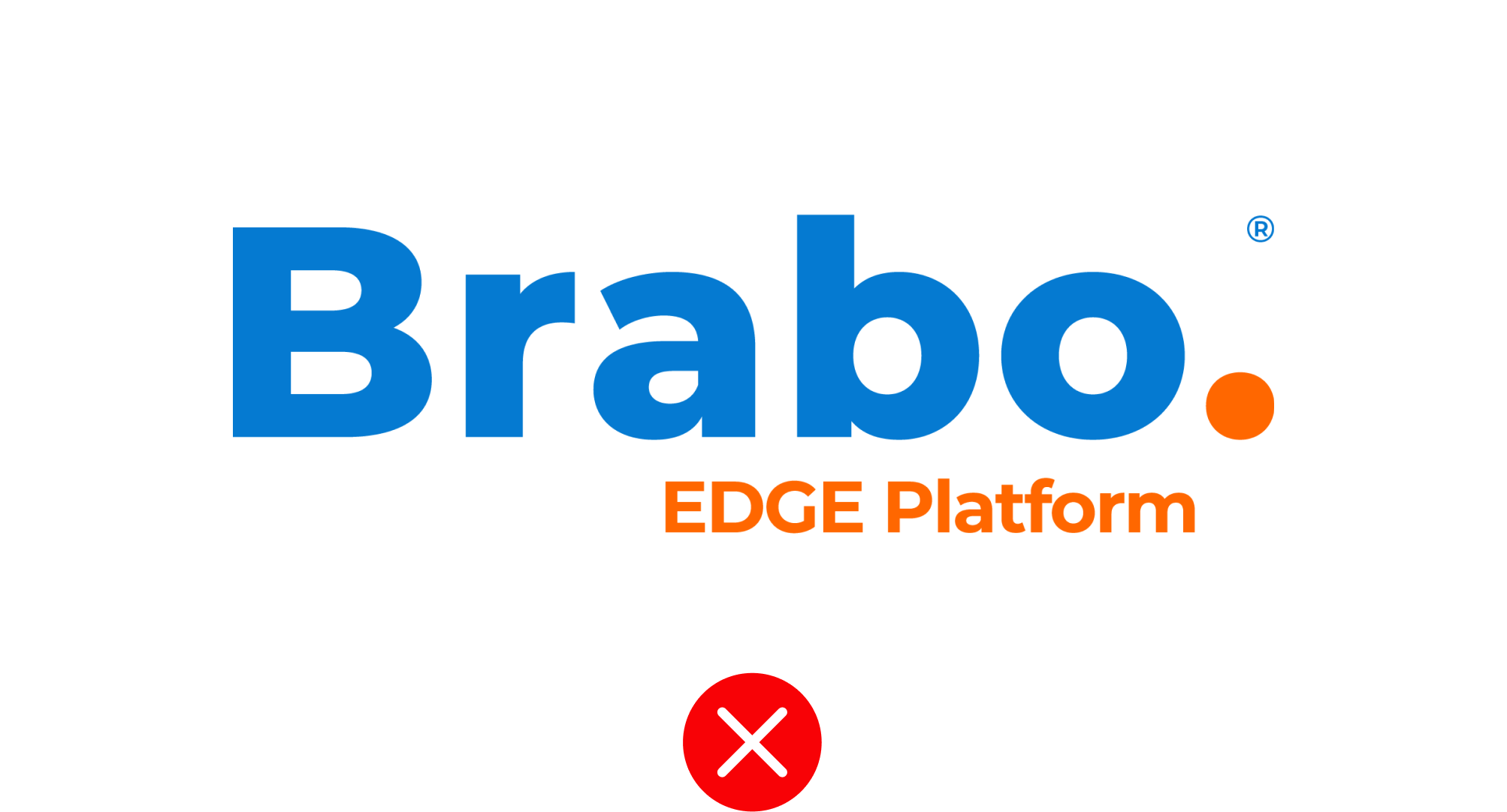
Orange dot at the end should not be used as outline
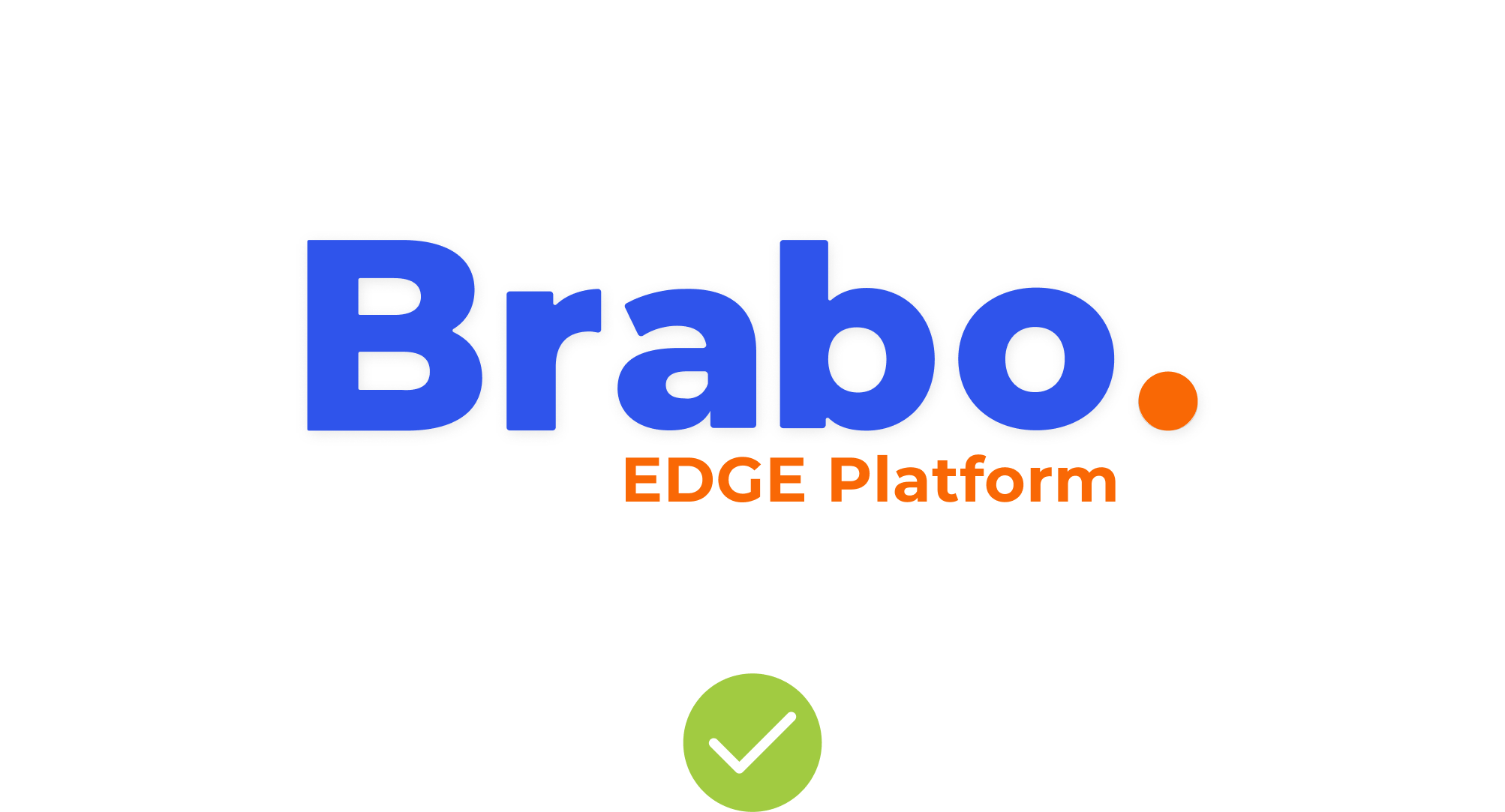
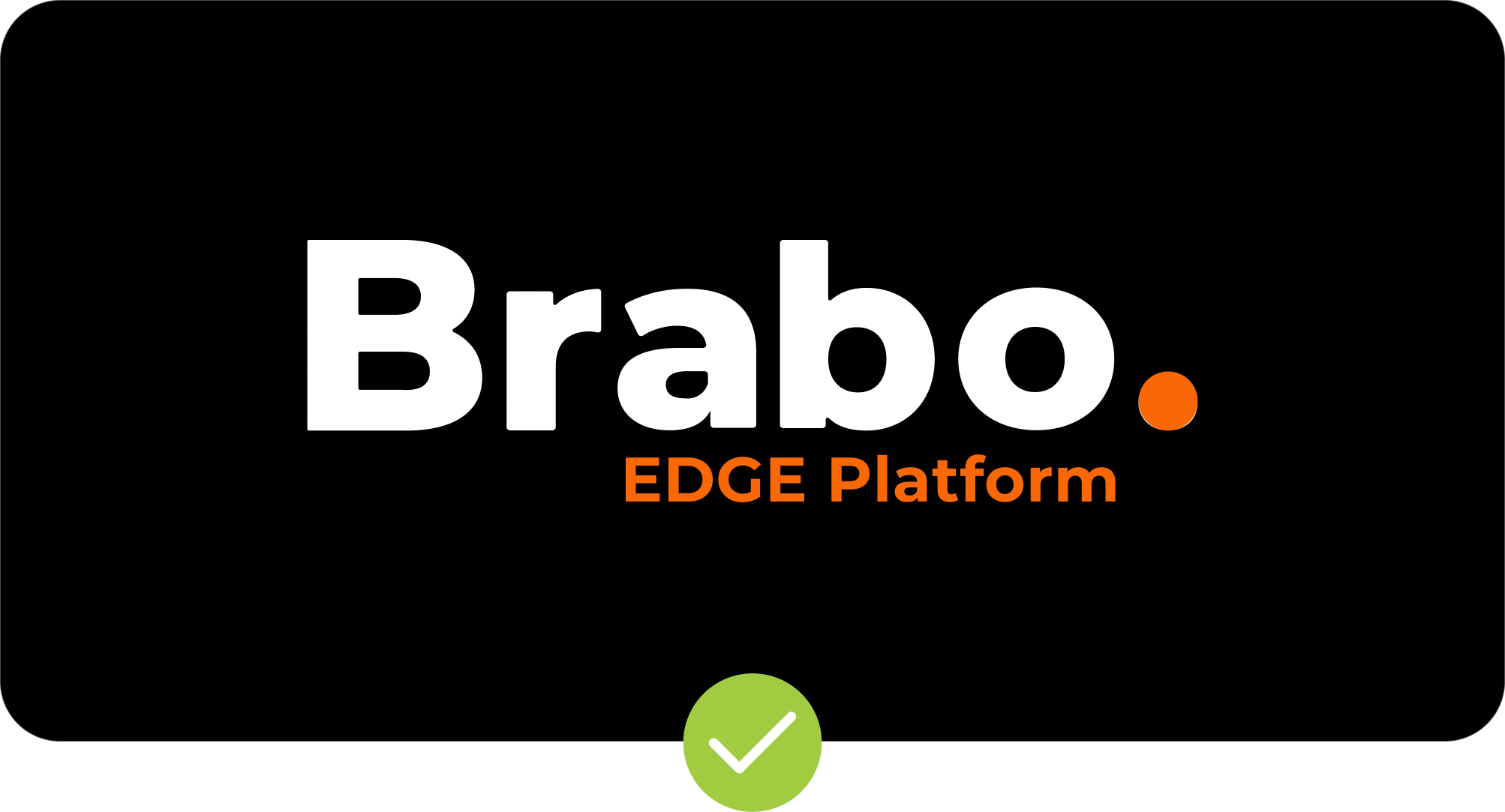
Only Brabo Word mark without Symbol is allowed to use

Only Brabo Symbol without word markis allowed to use
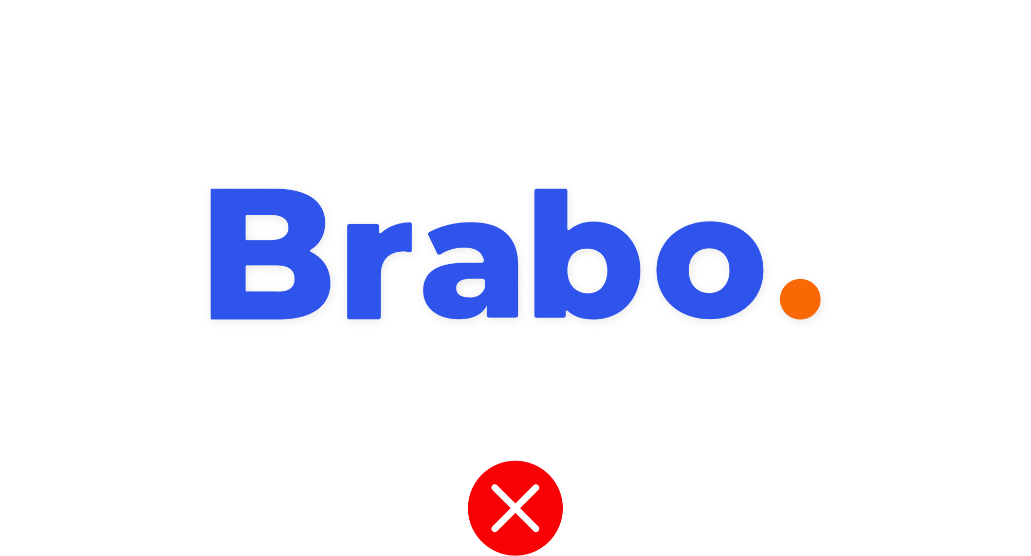
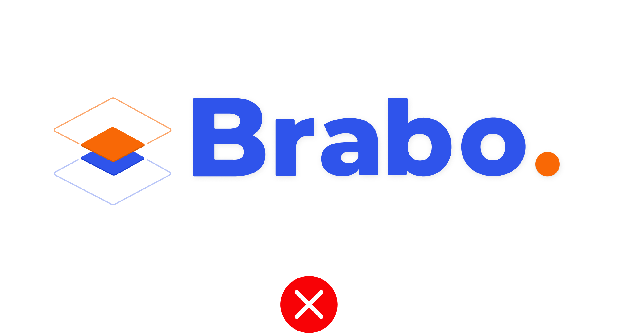
Wordmark without Edge platform is not allowed to use
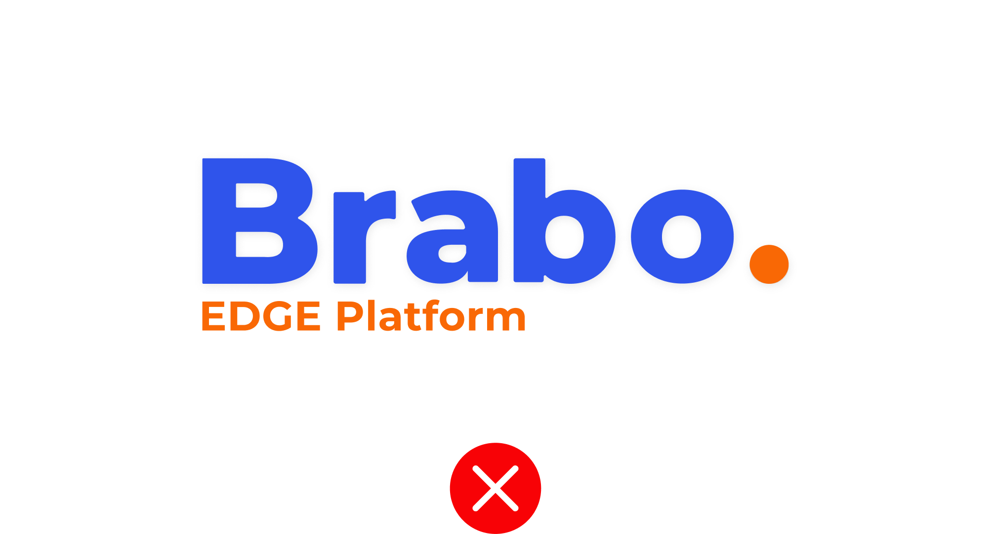
Edge Platform needs to be in the original position

Brabo Symbol should not be rotated or tilted
Brabo symbol cannot be used in the vertical position
Logo should not be stretched

Brabo symbol should not be stretched
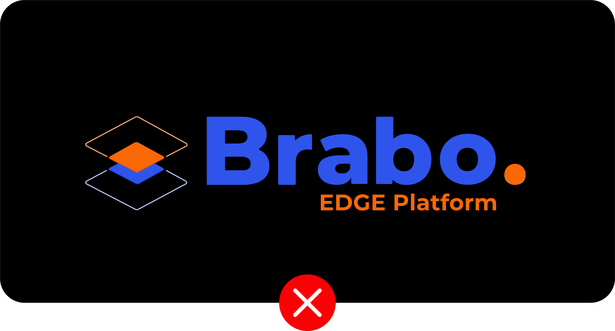
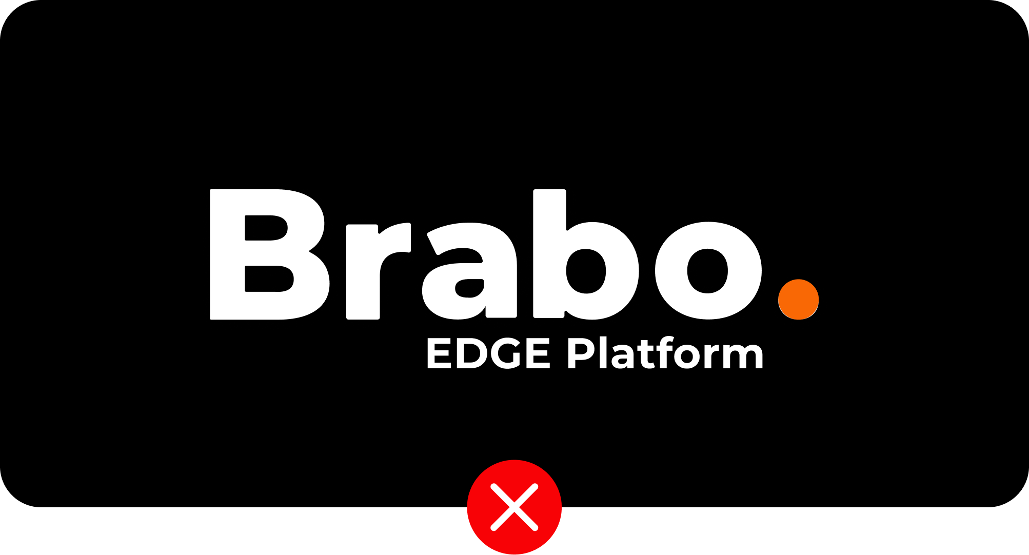
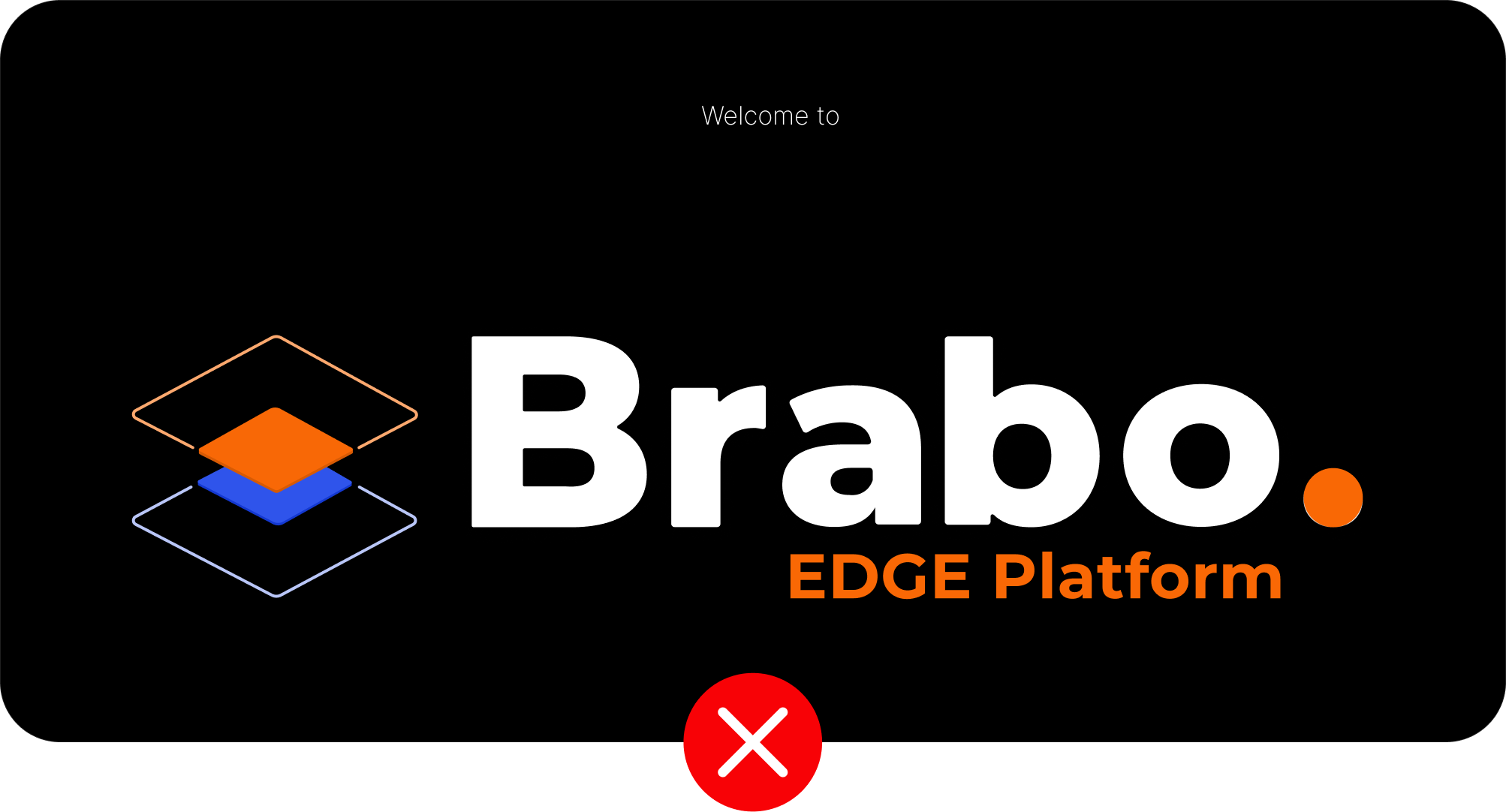
Brabo word mark should be only in white color in dark BG
Only Brabo of word mark can be used with white color in dark BG

Brabo Symbol will remain in same colors even in dark BG
Edge platform need to be retained in orange color in dark BG
Don't use effects in logo
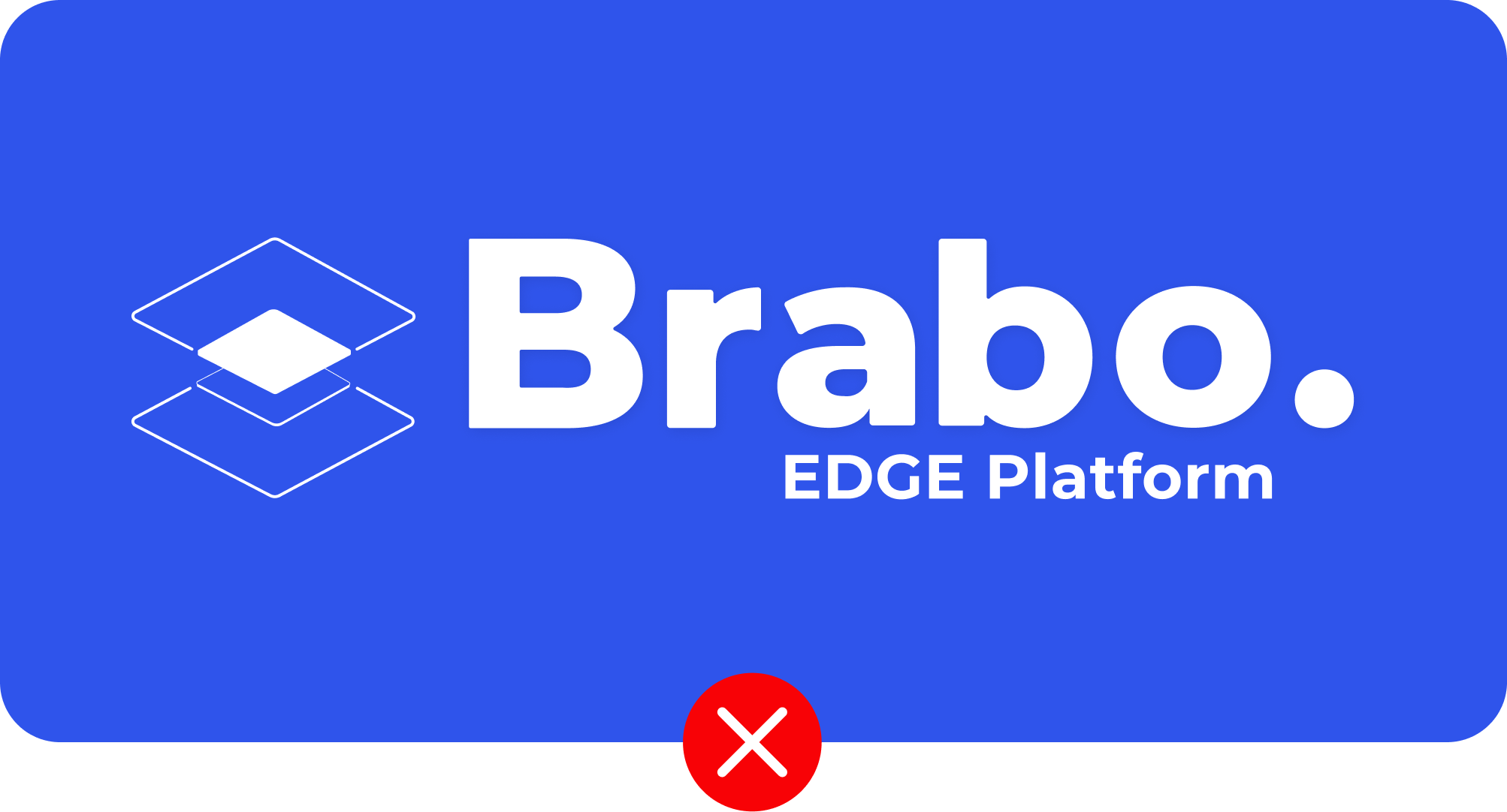
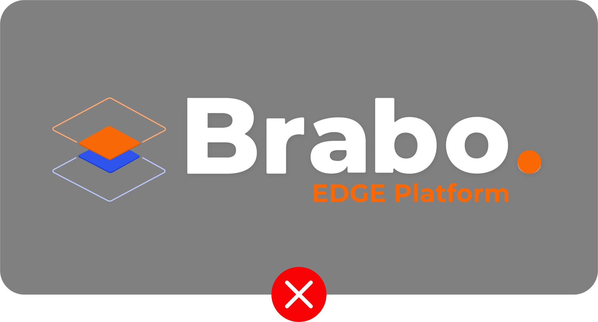
Don't use the full white logo in the primary color as BG
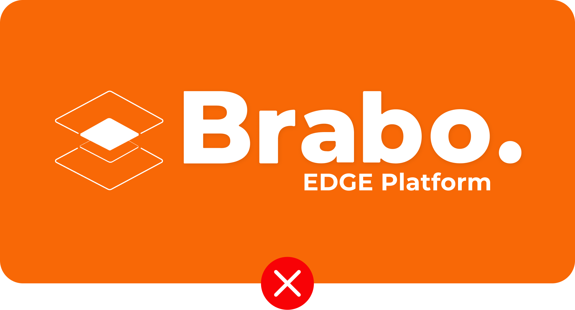
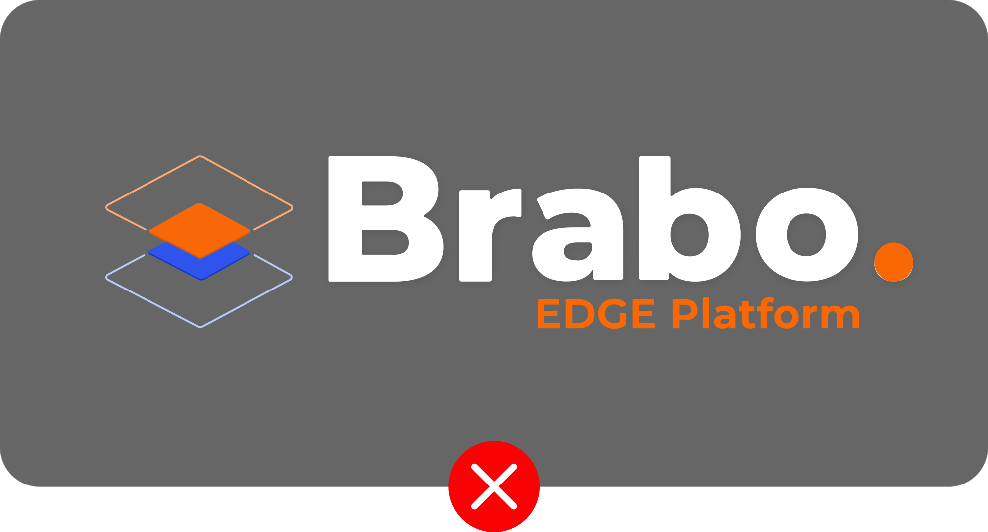
Don't use the full white logo in the secondary color as BG
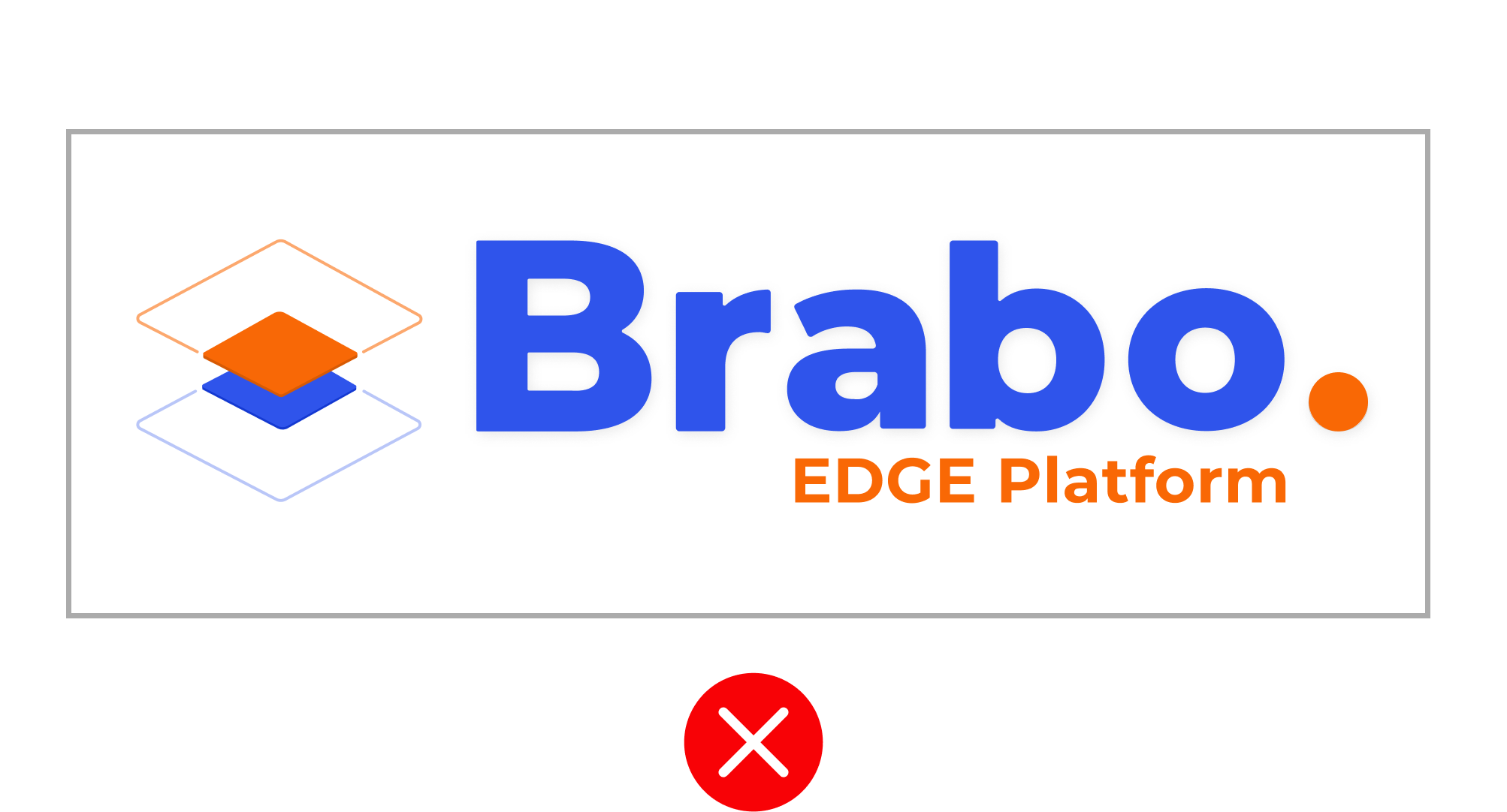
Don't use logo in a container
Don't use old logo
Don't use logo in a sentence
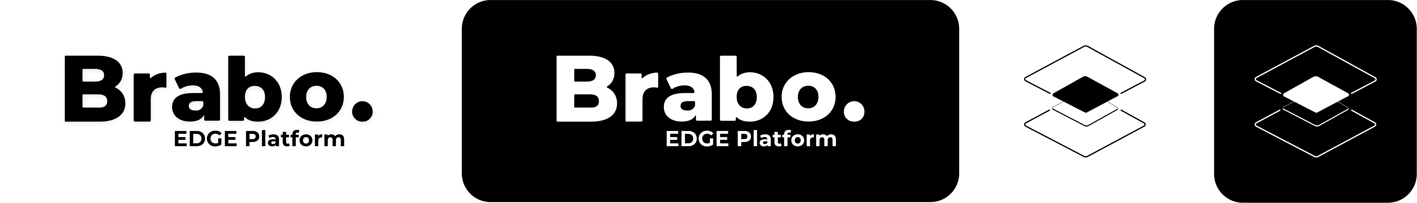
Usage of Logo (Examples)
The Brabo logo is a versatile design that can be used in various design requirements, whether it's for print or digital use. Here are some examples of how the Brabo logo can be used in different scenarios:
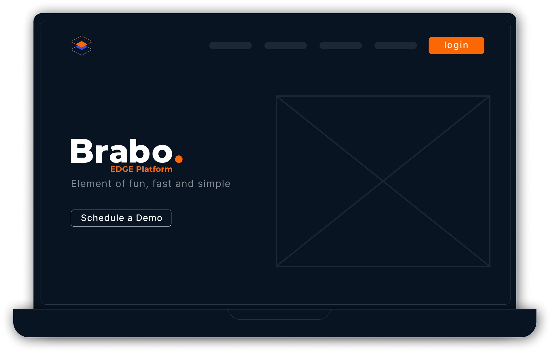
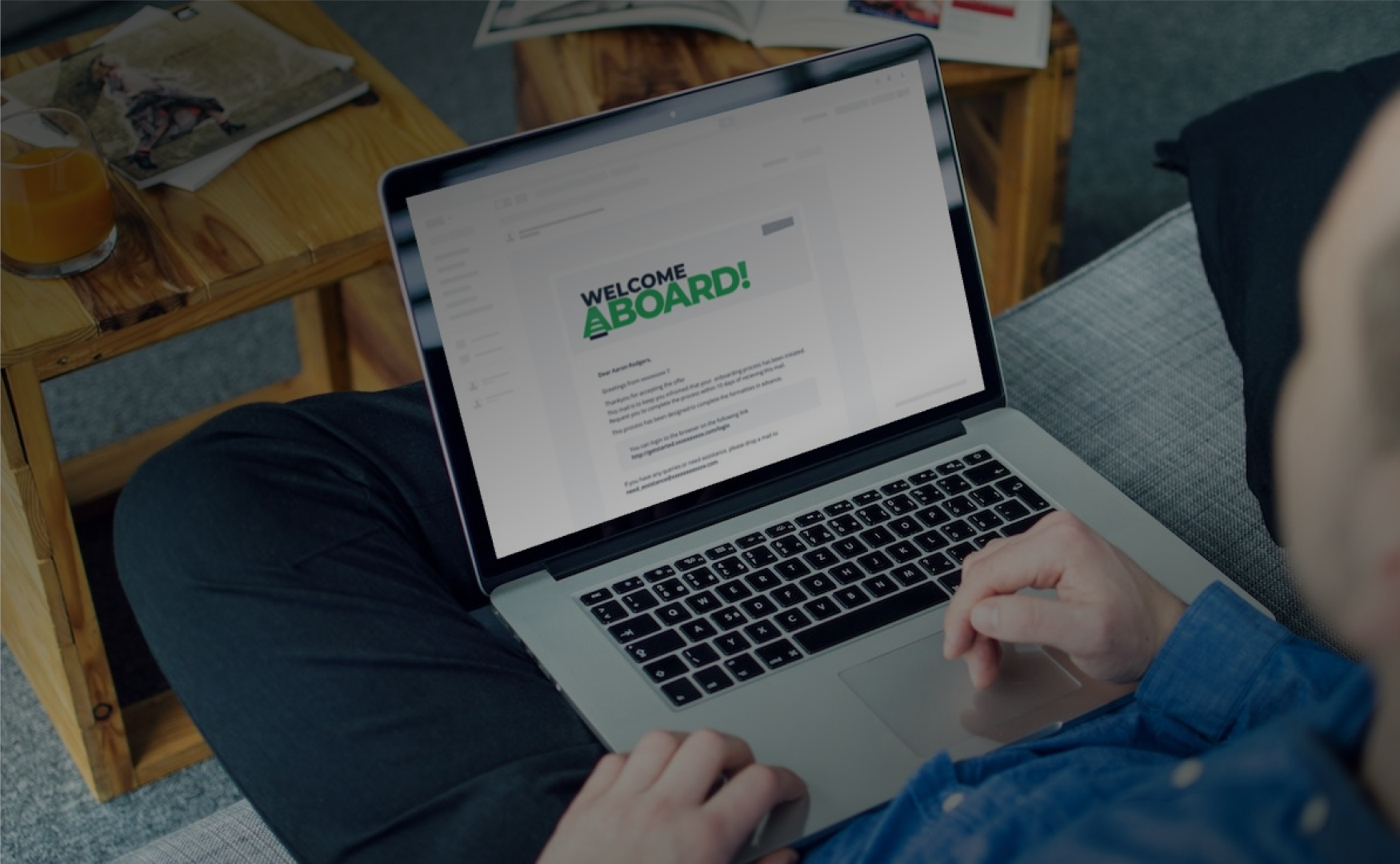
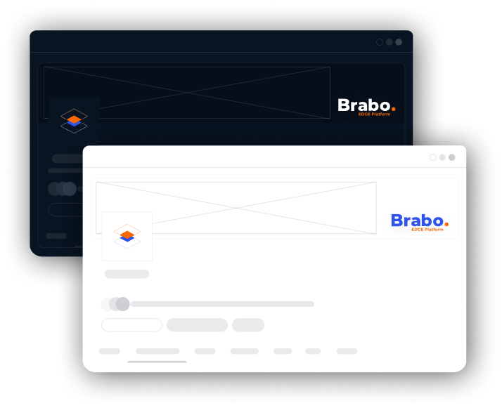
Website Design
The Brabo logo can be used as the website's main logo or favicon, providing a professional and cohesive branding identity.
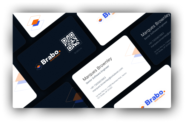
Business Card Design
The Brabo logo can be used in the design of a business card, adding a touch of sophistication and professionalism to the overall design.
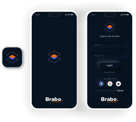
App Icon
The Brabo logo can be used as the app icon, providing a recognizable and professional branding identity to users
Splash Screen
The Brabo logo can be used in the app's splash screen, creating a seamless transition between the app launch and the main user interface.
Social Media Profile Design
The Brabo logo can be used as the profile picture for various social media platforms, providing consistency and brand recognition across different channels.
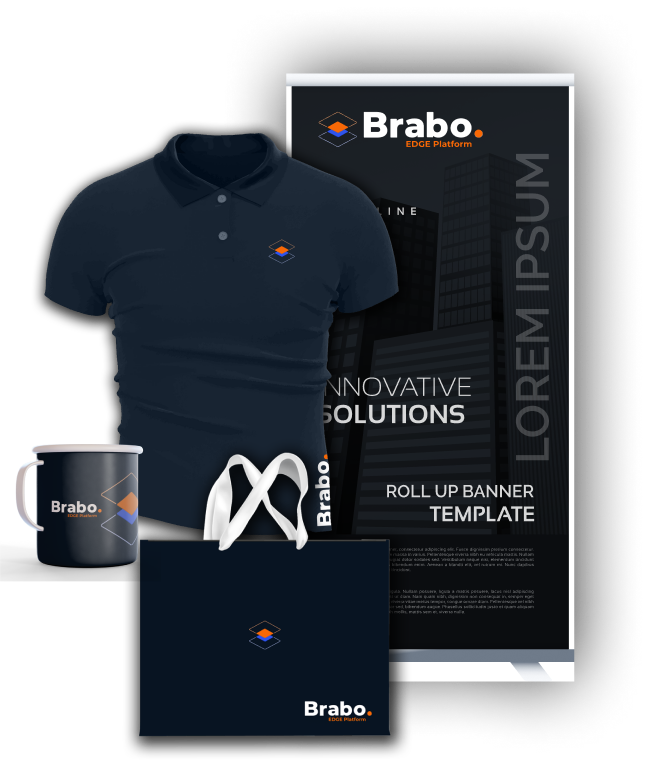
Merchandise Design
The Brabo logo can be used in the design of merchandise, such as t-shirts, hats, or bags, providing a stylish and recognizable branding identity to customers.
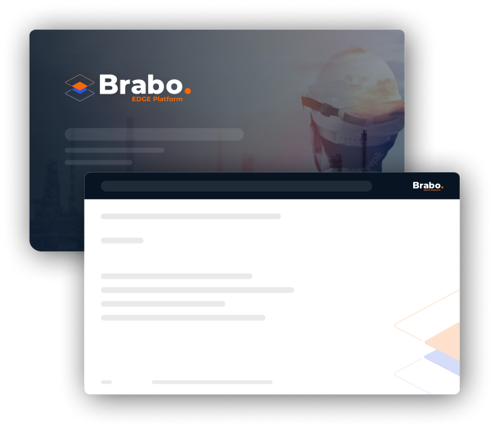
Presentation Design
Consistency in the use of Brabo logo, typography, colors, and imagery is crucial to maintaining a cohesive and recognizable brand identity in all presentation materials